Key takeaways
- UX design is how a site is structured and how people move through it. UI design is how it looks and feels once that structure is right. You need both, in that order
- A UX designer's job is to make the right thing easy to do, using research, information architecture, wireframes, and testing rather than decoration
- Good UX follows a few durable principles: clarity over cleverness, fewer choices, fast feedback, and consistency. Trends come and go; these do not
- On a real website, UX and UI are not separate from performance. A beautiful interface that loads in four seconds still loses the visitor
- We design in the open order: structure first with wireframes, surface second with mockups, then build it to load fast and convert
The short version
UX/UI design is the work of making a website both sensible to use and good to look at. UX (user experience) settles how the site is structured and how people move through it. UI (user interface) settles how it looks and feels once that structure is right.
I build and design websites for a living, so I will keep this practical rather than academic. The short version: get the structure right first, make it look good second, then build it so it actually loads fast. Skip the first step and you get a pretty site nobody can use. Skip the second and you get a usable site nobody trusts.
This guide explains what UX and UI design are, how they differ, the process we use, the principles that hold up over time, and where design meets the thing that pays the bills: conversion.
UX vs UI: what is the difference
The simplest way to hold the difference in your head: UX is the plan, UI is the paint.
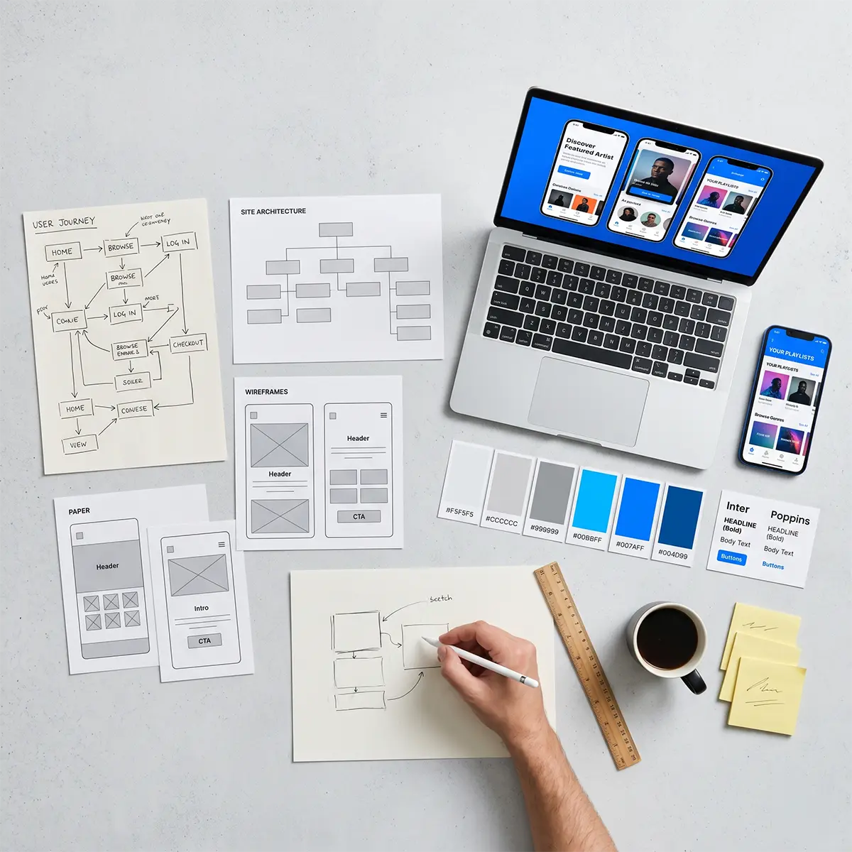
UX design is about behaviour and structure. It answers questions like: what is this visitor trying to do, what do they need to see first, how many steps does it take to get there, and what gets in the way. The deliverables are things like site maps, user flows, and wireframes. None of them are styled.
UI design is about the visible surface. It answers: what does each screen look like, how is it laid out, which typeface and colours carry the brand, how big is the tap target, how does a button look when you hover it. The deliverables are high-fidelity mockups and a design system.
You need both, and the order matters. Deciding what goes where (UX) before deciding how it looks (UI) is far cheaper than discovering halfway through the visual design that the structure was wrong.
What a UX designer actually does
A UX designer's job is to make the right thing easy to do. That is the whole discipline in one sentence. Everything else is method.
In a typical project that means a few concrete activities:
- Understand the user. Who is coming to this site, what do they want, and what do they already believe when they arrive.
- Map the structure. Decide what pages exist, how they relate, and what lives on each one. This is information architecture.
- Sketch the flows. Wireframe the key journeys, like landing to enquiry, or product to checkout, before any styling.
- Prototype and test. Turn wireframes into something clickable, put it in front of real people, and watch where they hesitate.
Notice that none of that is "make it pretty." Decoration is UI's job. UX is the unglamorous structural work that decides whether the pretty version will actually function.
The UX/UI design process
Our process moves from cheap-to-change to expensive-to-change on purpose. The earlier a decision is made, the easier it is to change, so we make the big structural decisions while they are still cheap.
- Discovery. Goals, audience, competitors, and the one or two actions the site must drive.
- Information architecture. The page structure and navigation, agreed before anything is drawn.
- Wireframes. Low-fidelity layouts that settle structure, hierarchy, and flow with no colour or styling. We cover this stage in detail in From Wireframes to Mockups: Our UX and UI Process.
- High-fidelity mockups. The visual design: brand, type, colour, imagery, states.
- Build and validate. The design becomes a fast, accessible, real website, then gets checked against the goals it was meant to serve.
The point of working in this order is that you are never improvising the important decisions in the browser at the end, when changing them costs the most.
UX design principles that matter
Trends change every year. The principles below do not, which is why they are worth more than any trend list.
- Clarity beats cleverness. If a visitor has to work out what something does, the design has failed. Obvious wins.
- Fewer choices, better decisions. Every extra option on a page is a small tax on the visitor's attention. Cut what does not earn its place.
- Fast feedback. When someone clicks, taps, or submits, the interface should respond immediately and visibly.
- Consistency. The same action should look and behave the same way everywhere. Surprises are for novels, not navigation.
- Respect the thumb and the eye. Most traffic is mobile. Tap targets, reading length, and contrast are not afterthoughts.
If you only remember one, remember the first. Most bad web experiences are not ugly. They are confusing.
UI/UX design trends in 2026
Trends are worth knowing and worth holding loosely. In 2026 the ones we actually see helping, rather than just looking current, are restraint-led: generous whitespace, large readable type, fewer but more deliberate animations, accessible-by-default colour, and dark mode treated as a real design target rather than an inverted afterthought.
The trends we are wary of are the ones that fight the visitor: heavy scroll-jacking, motion that delays content, and "immersive" intros that get in the way of the one thing the visitor came to do.
If you run an online store, the trend conversation is a bit different, because store layouts have their own conversion patterns. We cover those separately in Ecommerce Web Design Trends for 2026 That Help Sales. This guide stays on the broader UX/UI discipline.
What good UX looks like: examples
Good UX is usually invisible, which makes it hard to point at. Here are a few everyday examples of the discipline doing its job:
- A contact page where the form is the first thing you see, not buried under three paragraphs.
- A checkout that shows the total, including delivery, before asking for card details.
- Navigation that uses the words your customers use, not your internal department names.
- A pricing page that answers "what will this cost me" in the first screen, not after a sales call.
In each case the design removed a question or a step. That is the work. The visual polish on top is UI, and it matters, but the experience is what the visitor actually feels.
Where UX/UI meets performance and conversion
Here is the part most design guides leave out: on a real website, design is not separate from speed. A beautiful interface that takes four seconds to load has already lost a chunk of its audience before the first impression even renders.
This is why we treat UX, UI, and performance as one job rather than three. A clear structure (UX) and a clean surface (UI) only pay off if the page arrives quickly and stays stable while it loads. That overlap is also why good design tends to help search rankings: the same things that make a page pleasant to use, like logical hierarchy and fast, stable rendering, are things Google measures.
If you want the conversion side in depth, see Conversion Rate Optimisation: Turning Traffic Into Revenue. The summary: design decides whether visitors can act, performance decides whether they stay long enough to.
How we approach UX/UI at TurboPress
We design in the order described above, then build it ourselves, which means the structure and the surface survive contact with a real, fast codebase instead of getting watered down at handoff. Wireframes settle the plan, mockups settle the look, and the build keeps both intact while hitting real performance targets.
If you are planning a new site or a redesign and you want this level of thinking behind it, our WordPress web design and development work starts exactly here, with the experience, not the decoration. Start a conversation and tell us what the site needs to do.