Key Takeaways
The 5-second rule: if visitors can't understand what your product does in 5 seconds, they leave
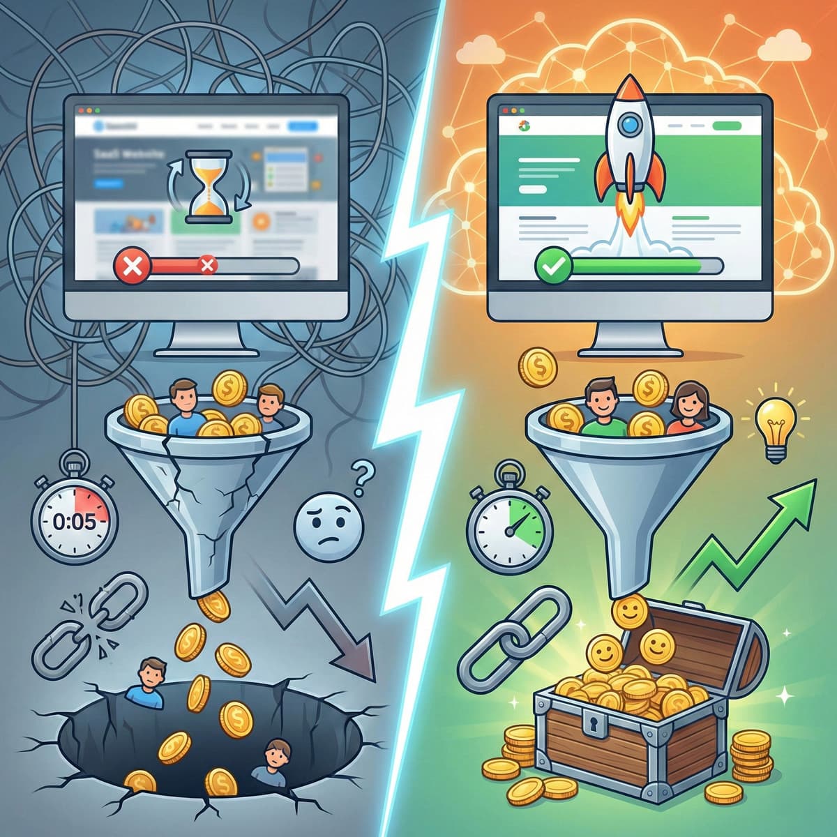
40% of visitors abandon SaaS sites with poor performance or outdated visuals -- before they even see your product
Interactive demos convert 2x better than 'book a demo' CTAs, yet most SaaS companies still hide their product behind a form
Three-tier pricing pages convert 31% better than pages with 4+ tiers
91% of marketing leaders say their website drives more revenue than any other channel -- yet SaaS companies chronically under-invest in it
The 5-second problem
Here's a test I run on every SaaS website I audit.
I open the homepage, start a timer, and read for exactly five seconds. Then I close the tab and write down what I think the company does, who it's for, and why I should care.
If I can't answer all three, the site fails. And most SaaS sites fail.
They fail because the headline says something like "Empower your teams with intelligent solutions." That means nothing. Or the hero area is a looping animation of a dashboard nobody understands. The first thing you see is a wall of logos with no explanation of what the product actually does.
Five seconds. That's your window. Not because visitors are impatient (though they are), but because they have fifteen other tabs open and ten other products to evaluate. Your homepage has one job: make the visitor decide, in five seconds, that this is worth another sixty seconds of their time.
91% of marketing leaders say their website drives more revenue than any other channel. And yet most SaaS companies treat it as a design project that gets refreshed once a year instead of the revenue engine it should be.
The 40% problem
40% of visitors abandon SaaS sites with poor performance or outdated visuals. Before they see the product. Before they understand the value proposition.
This is not a small leak. If your site gets 30,000 monthly visitors and 40% bounce immediately due to speed or design issues, you're losing 12,000 potential evaluations every month. At even a modest 3% conversion rate, that's 360 signups per month you're leaving on the table. Multiply that over a year, apply your average contract value, and the number gets uncomfortable fast.
Pages that load in under 3 seconds convert 32% better than slower pages. We covered the full breakdown of how load time affects SaaS revenue in a separate post, but the summary is: fix your speed before you fix anything else. No amount of clever copywriting compensates for a homepage that takes 4 seconds to render.
Core Web Vitals are the specific metrics Google uses to measure page experience, and they affect both your search rankings and your conversion rate. If you're below 70 on mobile PageSpeed, start there.
The homepage that converts
A SaaS homepage needs to do four things. Not twelve. Four.
1. Explain what you do and who it's for
Above the fold. In plain language. No jargon. No "leverage synergies across your workflow."
The formula that works: [What you do] for [who you do it for] so they can [specific outcome].
"Automated invoice processing for mid-market finance teams. Close the books 40% faster." That's clear. I know what it is, who it's for, and what I get.
"Unlock the future of financial operations." That's nothing. I still don't know what you do.
The stranger test: show your headline to someone who's never seen your product. If they can't explain what you sell back to you in one sentence, rewrite it.
2. Prove it works
Social proof needs to appear within the first scroll. Not buried in a testimonials page that nobody visits. Right there, on the homepage, near the headline.
Logo rows of recognisable customers. A specific metric from a specific customer. "Reduced onboarding time by 40% at Company X." Not "trusted by thousands of companies." Thousands of companies is vague. One specific company with a specific result is proof.
3. Show the product
SaaS companies that show interactive demos on their homepage convert 2x better than those that hide the product behind a "Book a Demo" form.
Think about that. You built a product. The product is your best argument. And you're hiding it behind a form that asks for a phone number.
Screenshot carousels are better than nothing. Animated walkthroughs are better than screenshots. Interactive demos where visitors can click through the actual interface are best. Tools like Navattic, Storylane, and Tourial make this possible without engineering effort.
If your product looks good and works well, show it. If it doesn't look good, fix it. Either way, hiding it signals that you're not confident in it.
4. Make the next step obvious
One primary CTA. Not three. Not a "Start Free Trial" competing with a "Book a Demo" competing with a "Watch a Video." Each additional CTA dilutes the others.
Pick the action that matters most for your funnel. If you have a self-serve trial, the CTA is "Start Free Trial." If you require a sales conversation for enterprise deals, the CTA is "See a Demo." One button. Repeated at the top and the bottom of the page.
The pricing page that doesn't scare people away
The pricing page is the highest-intent page on your SaaS site. People who click "Pricing" are seriously evaluating. They've moved past curiosity.
We wrote an entire post about the psychology of SaaS pricing pages, but here's the executive summary:
Three tiers convert 31% better than four or more. The paradox of choice is real and measurable. Three options (starter, professional, enterprise) give the buyer a clear path. Five options give them a reason to open a spreadsheet and compare, which is a reason to leave.
The middle tier should be visually dominant. Larger card, "Most Popular" badge, different colour. You want 60-70% of buyers landing on this tier. The low tier anchors the price. The high tier makes the middle feel reasonable. Anchoring works even when people know it's anchoring.
Show the price. 61% of B2B buyers prefer a rep-free buying experience. Hiding pricing behind "Contact Sales" doesn't protect you. It filters out the majority of potential buyers. "Starting at" pricing is fine for enterprise tiers. A total absence of pricing is not fine for any tier.
Annual vs. monthly toggle: default to annual. The first number visitors see becomes their reference price. Anchor on the lower annual price. Frame the savings as a percentage ("Save 20%") for most audiences.
The trial flow that retains
Getting someone to click "Start Free Trial" is half the battle. Getting them from trial to paid is the other half, and it's where most SaaS companies lose.
Benchmark yourself
Homepage to trial conversion: 2-5% is average, 7-10% is excellent. If you're below 2%, you have a clarity or trust problem on your homepage. If you're above 5%, your homepage is doing its job and your focus should shift to the trial experience.
Trial to paid conversion: 10-15% is typical. 25%+ indicates strong product-market fit. If you're below 10%, users are signing up but not finding value quickly enough.
Reduce friction in signup
Every field you add to your signup form reduces conversions. Name and email should be enough to start a trial. Company name, role, phone number, how-did-you-hear-about-us, all of that can wait until later. Or never. The point of the trial is to get someone using the product as fast as possible.
Social login (Google, GitHub, whatever fits your audience) reduces signup friction further. One click, no form, straight into the product.
Optimise time-to-value
The single most predictive metric for trial-to-paid conversion is how quickly a user experiences the product's core value. If your product's value is "automated reports," the user should see an automated report within their first session. Not after three days of configuration.
Map your activation events. Figure out which actions correlate with conversion. Then design the onboarding to guide users to those actions as fast as possible. Strip away everything that isn't on the path to the first moment of value.
Mobile-first is not optional
83% of landing page visits are mobile. Read that again.
Most SaaS companies design their website on desktop monitors, test it on desktop browsers, and approve it based on how it looks on a MacBook Pro. Then 83% of their traffic arrives on phones.
I see this constantly. Beautiful desktop homepage with a perfectly balanced hero section. On mobile, the headline gets truncated, the CTA button sits below three scroll lengths of hero image, and the interactive demo doesn't work on touch devices.
If your mobile experience is an afterthought, you're building your site for the 17% and neglecting the 83%. Design mobile first. Test mobile first. Every page, every interaction, every CTA: check it on a phone before signing off.
PLG is table stakes, not a strategy
Every SaaS company in 2026 claims to be product-led. It's in every pitch deck and every marketing page. "We're product-led." Congratulations. So is everyone else.
PLG is a delivery mechanism, not a competitive advantage. The competitive advantage is in the execution: how fast your site loads, how clear your messaging is, how frictionless the signup flow is, how quickly users reach the first moment of value.
Two SaaS companies can both be "product-led" and have completely different outcomes. The one with a 1.5-second load time, a clear headline, and a one-click signup will crush the one with a 4-second load time, a jargon-filled homepage, and a six-field registration form. Same strategy. Different execution.
The website is where PLG lives or dies. If you claim PLG but haven't invested in the digital experience that delivers it, you don't have a PLG strategy. You have a PLG aspiration.
The conversion framework
If I had to distil this entire post into a sequence, it's this:
Speed first. If your site takes more than 3 seconds to load, nothing else matters. Fix the infrastructure.
Clarity second. Can a stranger understand what you do in 5 seconds? If not, rewrite the homepage.
Trust third. Social proof, specific customer results, security badges. Buyers need to believe your product works before they'll try it.
Friction last. Once speed, clarity, and trust are solid, then optimise the signup flow, reduce form fields, and add social login. Not before.
Most SaaS companies start with the friction layer (tweaking button colours and testing CTA copy) while ignoring the fact that their site loads in 4 seconds and their headline doesn't explain what the product does. You're optimising the checkout page of a store nobody can find.
What good looks like, by the numbers
For reference, here's where top-performing SaaS websites sit in 2026:
| Metric | Average | Top 10% |
|---|---|---|
| Homepage to trial | 2-5% | 7-10% |
| Trial to paid | 10-15% | 25%+ |
| Mobile PageSpeed score | 50-70 | 90+ |
| Time on pricing page | 45 seconds | 2-3 minutes |
| Bounce rate (homepage) | 50-65% | 30-40% |
If your numbers are below average, you probably don't have a marketing problem. You have a website problem. And website problems are fixable.
Where to start
If you're looking at your SaaS website and feeling overwhelmed by the list of things that need fixing, here's my advice: don't do everything at once.
Pick the page with the highest traffic and the worst performance. Usually that's the homepage. Run PageSpeed Insights. Read the headline with fresh eyes. Check the mobile experience. Start there.
Our website redesign playbook covers the full process for turning an underperforming site into one that actually works. But you don't need a full redesign to start seeing improvements. Sometimes the difference between a 2% and a 4% conversion rate is a clearer headline, a faster server, and a shorter signup form.
If you're choosing between React and WordPress for your next build, the answer for most SaaS marketing sites is Next.js for speed and flexibility. We've covered the performance optimization specifics in detail.
But the technology is secondary. The thinking comes first. Know what your site needs to say, to whom, and in what order. Then build the infrastructure to say it fast.
The bottom line
Your SaaS website is your highest-leverage growth asset or your most expensive leak. The difference between those two outcomes is not a redesign budget or a new brand identity. It's speed, clarity, and a relentless focus on reducing the distance between a visitor and their first moment of value.
Five seconds to make them stay. Three seconds to load. And one clear CTA to move them forward.
Get those right and the rest of the funnel gets dramatically easier. Get them wrong and no amount of ad spend, content marketing, or sales hiring will compensate.
Related reading
- The psychology of SaaS pricing pages -- Why three tiers beat five and how anchoring drives conversion.
- Why your SaaS website's load time is costing you more than your ad budget -- The math behind speed and revenue.
- Authority Architecture for SaaS -- How structured content drives 186% more organic traffic.
- Core Web Vitals for non-developers -- The performance metrics Google uses to evaluate your site.
- Next.js performance optimization: a complete guide -- The technical playbook for building a fast SaaS site.
- React vs WordPress in 2026 -- Choosing the right technology for your SaaS website.
- From template site to high-performing asset: our website redesign playbook -- The full process for fixing an underperforming site.

Written by
Barry van Biljon
Full-stack developer specializing in high-performance web applications with React, Next.js, and WordPress.
Where this fits into a build
This is the kind of work we do every day. Here is where to go next.